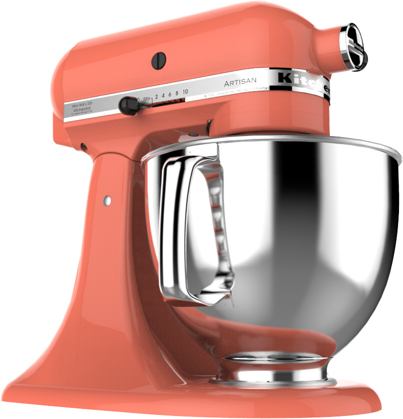
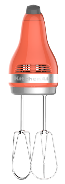
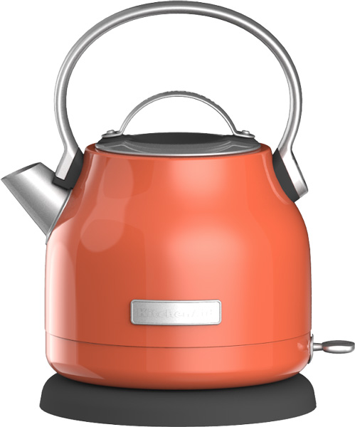
KitchenAid brand debuted “Bird of Paradise,” the 2018 Color of the Year, at the International Home and Housewares Show in Chicago. This is the first time that the brand has ever announced its own Color of the Year. Bird of Paradise is an energy-charged vibrant coral color with a high-gloss finish and powerful glow that is guaranteed to bring any kitchen to life and extends the brand’s legacy as an authority on color. Jessica McConnell, senior manager of the Color, Finish & Material Studio for Whirlpool Corporation, explained how the color was developed.
What was the process to develop the color of the year?
 We started discussing potential Color Of The Year options about 12 months ahead of launch. We were looking for a “sign of the times,” a color that reflects the world around it. This process begins by analyzing socio-cultural trends. Tracking the cultural mood helps us predict a color space that will trigger a positive emotional response — something people will truly desire. At the same time, we follow emerging fashion and interior design trends. The final color we create is our translation of these socio-cultural and aesthetic trends through the unique filter of our brand.
Who worked on the project?
The global color, material and finish design team worked together to align on a global theme. KitchenAid Color Finish Materials designers Fei Wang and Katie Remaly brought the color to life. Development began with our internal paint experts and became market-ready with the support of our production suppliers. Katie led the effort to bring the theme to life through a visual narrative, along with one of our storytelling masters, Becca Goesling.
What were the inspirations/trends that led to the color?
 We were inspired by multiple things — one being the highly visual nature of our world (i.e Instagram). Lush visual experiences speak volumes and can take you on a multi-faceted journey in mere seconds. With our first color of the year, we wanted to take our audience on a visual vacation that was both energetic and comforting at the same time. We were also inspired by the global attraction to travel and memories. There is a hint of nostalgia within this color — a cheeky nod to the tropical aesthetic of the 1960’s (think the Brazilian artistic movement Tropicália or the Tiki Culture in the U.S.). In addition to focusing on the color itself, we were sure to step outside the color and consider the context as well. We took into account other trending colors such as deep, lush greens, which are the perfect backdrop for the warm, neon energy of Bird of Paradise.
How does it feel to be doing our own COTY for the first time?
Every color we make has a bit of a story behind it, so we really reveled in taking it a step further to create something iconic for the times and show the world that color can take you on a rich journey. With Bird of Paradise, we get to talk about the story in a more abstract and emotional way. It gives us the chance to reveal our development process and the true love and passion behind the creation of a new color for KitchenAid brand.