


A Glow of Optimism: KitchenAid 2020 Color of the Year


KitchenAid Brand Announces its 2020 Color of the Year
In 2018, Whirlpool Corporation’s KitchenAid brand made the bold decision to create its first Color of the Year, “Bird of Paradise.” This high gloss, distinctive coral-colored hue was a huge success in the marketplace, earning numerous accolades and recognition in the design community, as well as within the small appliance industry.
 “The Color of the Year is really important for our brand.” said Jon Bellante, global marketing director for KitchenAid. “We know that color is a huge part of KitchenAid brand’s success story since we first started launching colors back in 1955.”
“Our annual color is an opportunity for us to create an impact that keeps our makers in mind and meets them at this moment in time. We really are trying to think about our makers first and foremost by creating meaningful connections and inspiring them.”
Makers are KitchenAid’s core consumer, a unique group of people who love to cook or bake, and spend lots of time in the kitchen being creative. The brand uses a variety of methods to gain insights about this target consumer, which are then used to develop products and colors that appeal most to their sensibilities.
“When we think about our makers, we think first and foremost about what they’re doing in their kitchens and what they’re thinking about in the greater world around them. As we think about that world, there’s really a few key aspects that we latched onto.”
Some of those aspects Bellante refers to are trends centered around the ideas of optimism, balance, and tranquility.
 Optimism, Balance, and Tranquility
“We know around the world there is an underlying tone of optimism that consumers are looking for. They’re thinking about balance, not just from how they manage their time, but how they manage their food, how they manage their making, and how they manage their relationships. We’re really trying to allow our makers to think about finding time for oneself, for reflection and for that interpersonal introspective moment in today’s world of constant, fast-moving demands. As we developed our color of the year, we really sought inspiration around these macro trends and found them coming to life in Kyoto, Japan.”
Kyoto is a city that has traditionally been known for the idea of balance and tranquility for centuries. Whether it’s reflected in the idea of rebirth and new beginnings with the Cherry Blossom Festival each spring, the dramatic mountainscapes that bring a unique sense of balance to the region, or even their cuisine focused on Kaiseki cooking. (Kaiseki is a multi-course Japanese dinner made up of beautifully plated dishes, where the chef strives for perfection in every course. It has been called “the world’s greatest meal” by some experts.)
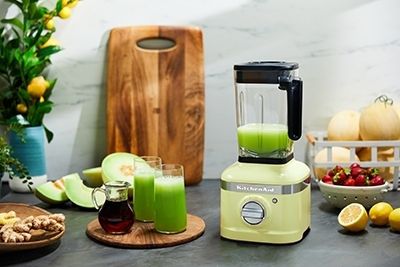
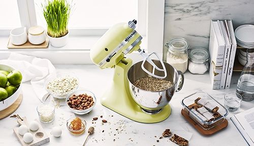
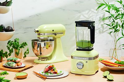
The new color will be available on the Artisan® 5.0 quart stand mixer, as well as the new K400 blender.
“Our stand mixer is core to our makers and it’s core to our brand. And we of course wanted to reflect that desire for optimism, balance, and tranquility on our core product. As we were looking at what these makers were creating in their kitchens, we also realized that our brand new innovation with the KitchenAid K400 blender fit with this story perfectly. It was the idea of being able to bring that balance and wellness to life through blended ingredients that deliver better tastes for our consumers.”
 What’s also exciting about this new color launch is that it’s happening worldwide.
“It’s going to be our first globally coordinated color launch,” said Bellante. “It’s not just happening in the U.S., it’s also happening in Canada, throughout Europe, and in Australia at the exact same time. We pride ourselves on being a North American brand with huge amounts of global influence in everything that we do, and as we were connecting with our makers on an ongoing basis globally, we were actually seeing these same trends and the same passions pop up in regions all around the world. So, this is a prime opportunity for us to really tackle the spirit of the moment in all regions where we sell products.”
Kyoto Glow not only fits the spirit of the moment, it also fits well within the entire color collection KitchenAid brand has developed over the years—focused on elevating the maker’s space, enabling them to express themselves in the kitchen, and further inspire their making.
“Kyoto Glow really sparks an emotion, and we think it works nicely in and of itself, but also in the broader context of the color portfolio that is KitchenAid.”
For more information, head to kitchenaid.com.